
CASE STUDY 01
Filmporium
In a time where cinemas are being closed down due to the ongoing pandemic it’s important for businesses to have the most accessible and enjoyable online experiences for users when they return to the market. My goal with this project was to create an experience that would encourage users to want to return to the Filmporium cinema after it’s been shut, and be greeted with a polished and effortless experience regardless of the platform they visit the website on.


The Problem
Cinemas tend to have crowded and incoherent website experiences creating unnecessary issues for their users.
My Solution
A revised version of the “Filmporium” website that is smoother and more efficient with added features to create a trouble-free experience in hopes to encourage cinema goers to visit their local cinemas.

Catch Your Favourite Flick
The home of the Filmporium website greets you with the most popular films at the time of login, and if you have your own profile you will be suggested films that are on in the cinema that we think you will enjoy. Make finding the right film for you easier by filtering through dates, times and location.
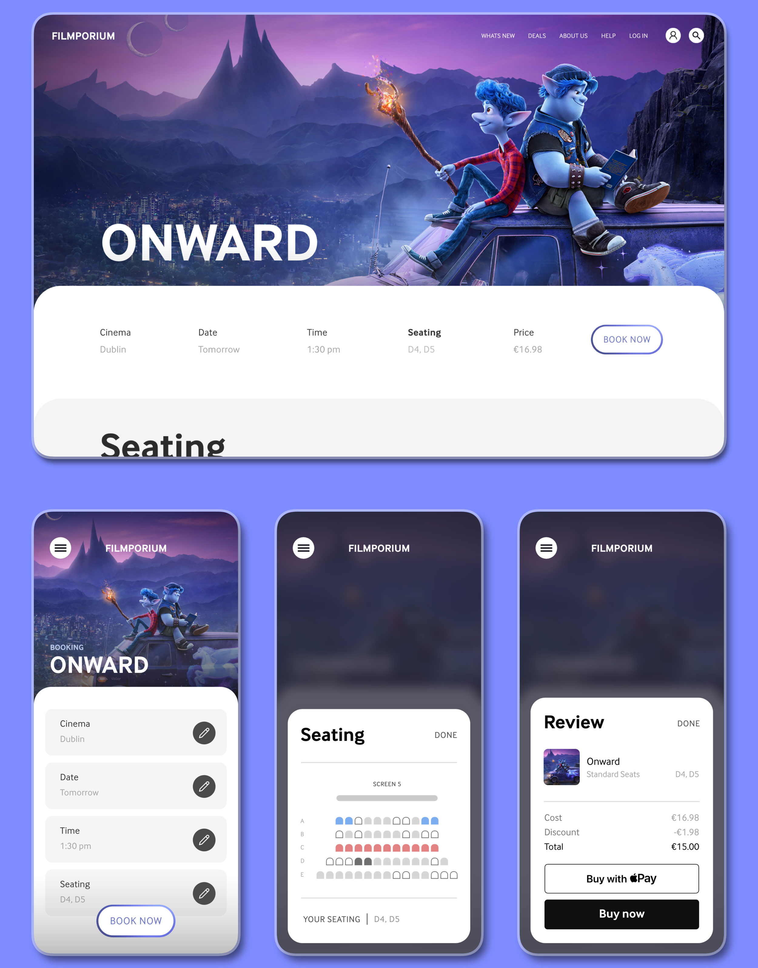
Making It Easier For You
The booking process has been streamlined and minimalised to create the perfect experience for you every time. Each section is automatically filled for you in order for you to book your tickets in the fastest way possible. Depending on the platform you visit Filmporium on, different booking options will be displayed in a way that will enhance your experience further whilst still providing the same options.

Read Up On Our Films
Get the information you need before seeing the films we know you’ll love. Scroll through information on the description, cast, trailers, show times and more. Filter through different dates to find the best time to visit our cinema for the movie you want. A translucent design allows you to remain at the same scroll level on the previous page you were viewing while looking at more information about your film for better efficiency.
My Process
One of my main goals with this project was to increase my researching and wireframing skills when designing for two different types of platforms and screen types. The idea was to create an experience that would be tailored to a platform of your choice and for the user to not be penalised for how they choose to access the cinemas website, but instead be rewarded with an easier and more cohesive experience. I began my process with ideating various ideas for what the website would look and feel like, along with ideas that could make it unique. This being my first UX project, I was excited to explore the different methods of the UX design process.
Preliminary Ideation
I began with a brainstorm session of different ideas for the Filmporium website. This not only included features for the website, but also various descriptive words that I felt would describe the end product and how it would make the user feel when using it. I then moved on to creating an affinity diagram to further explore these key ideas and concepts.
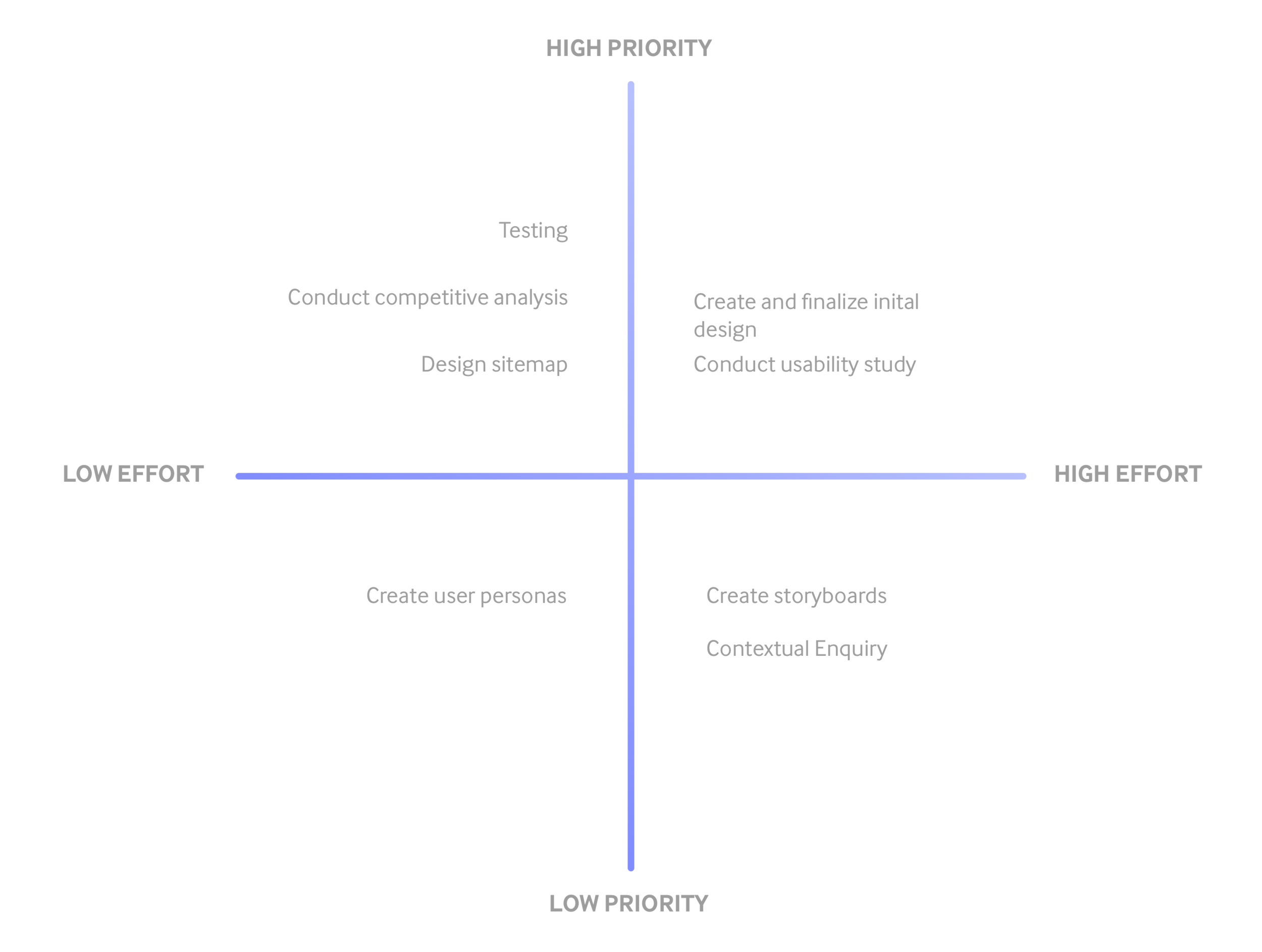
Prioritisation Plot
In order to better organise the different phases, processes and studies I will be conducting during this project I created a prioritisation plot to help me understand the most important things to focus on during the 4 week timeframe I have given myself. It was important to remember during this process and for the rest of the project that although certain sections will be higher priority than others, it is crucial for me to give each section 100% of my focus and attention to deliver the highest quality product possible.
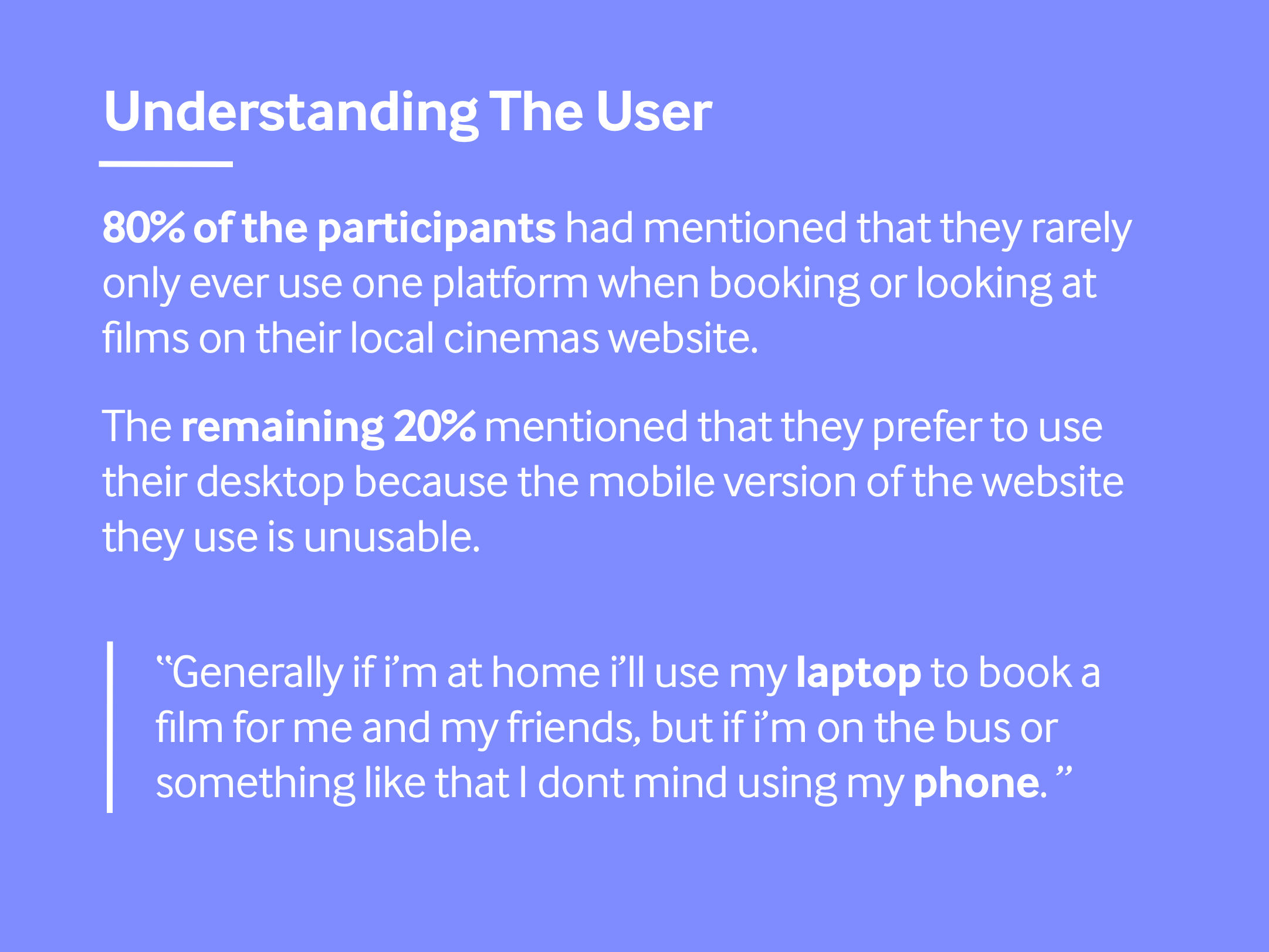
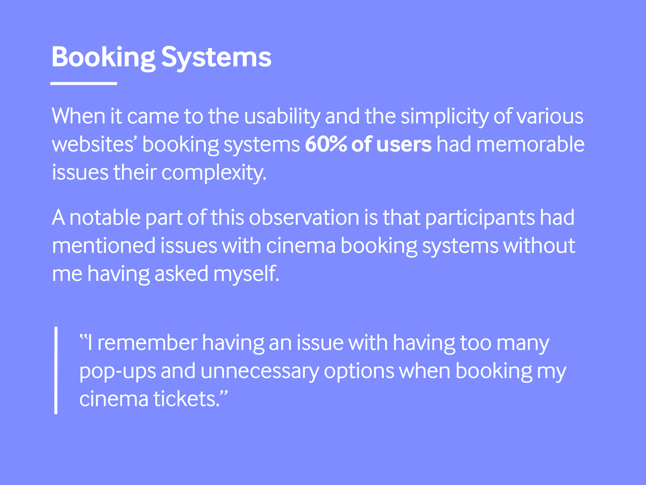
User Testing and Observations
I conducted an interview with a small sample size of five participants during the beginning of the research phase of my project. A majority of the questions I had for the participants revolved around their favourite aspects and their pain points in respect to cinema websites to gain a better understanding of my user goals.
Attracting More Users
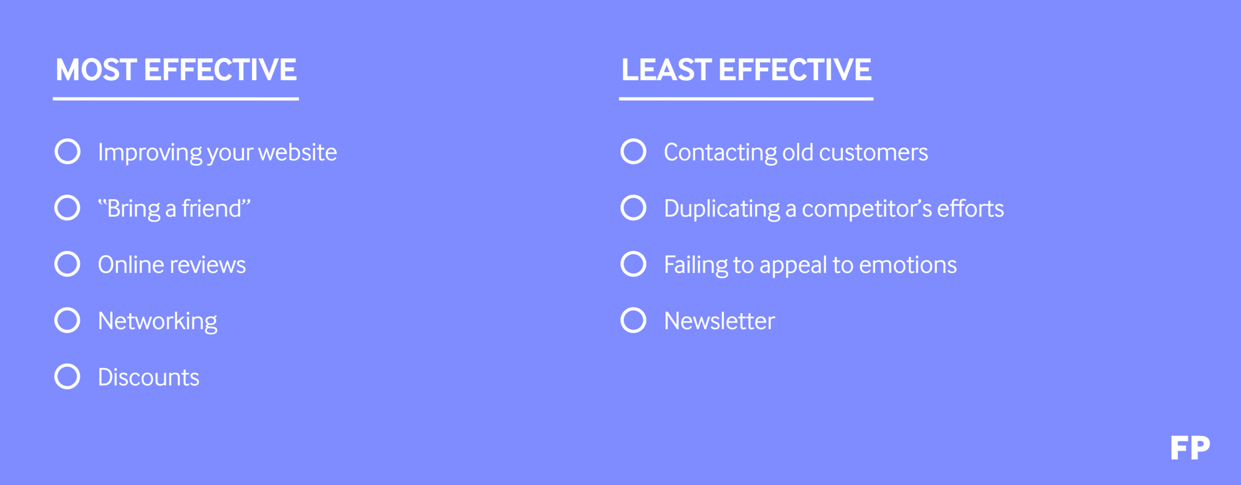
A large issue with many businesses, including cinemas, today during the ease of the covid-19 pandemic lockdown is getting customers in the door. To counter this issue I decided it would be a good idea for the website to somehow link users of the website to one another to help spread the message of the cinema opening along with seeing what your friends are up to when it comes to visiting the cinema. The solution to this problem began with research on the various common techniques businesses tend to use to gain new customers and then ideating on those methods.
After thorough research on the most productive practices to bring in new customers and how they have worked for businesses in the past, I categorised the methods into separate sections to recognise the most effective ways Filmporium can utilise them in it’s own website. My goal here was to just identify different common techniques used and then later on figure out my own method based off these ideas.
The User
I used a user persona diagram to further assist me in empathising with my users. These archetypical users represent the general goals, needs, frustrations and feelings of what a user of the Filmporium website could have before or during their use of the site. It’s important to be mindful of these feelings and needs to help create an experience tailored toward the user and what they would want rather than just assuming I already know what they want and skipping this step of the research process.

Key Path Scenarios
To identify with the various ways Mike could interact with the Filmporium website, I constructed some key path scenarios that considered the main features of the site. I focused on the primary features of the website to help keep the project on track to be completed within the 4 week timeframe given.

Information Architecture / Site-mapping
To further understand the structural design and information architecture of the Filmporium website and what each page consists of, I designed a diagram showcasing the various pages a user may visit. This allowed me to focus on the primary and secondary user flows of the website’s users to create an experience that was smooth and accessible for all users. I categorised the different pages by the users ability to visit them with one click from the home screen, and then I listed the sub pages of those pages.

Wireframes
Preliminary Wireframing
At the beginning of the design phase of my project I faced the most issues when it came to selecting a final design for certain pages for me to move on to the next stage of wireframing with. These issues mainly occurred with deciding on what home screen design to choose. I went with my second design because I felt it was more welcoming to users who were less familiar with the website and its structure. This stage of the design process was crucial to me because it helped me establish the websites own feel and look before moving on to the low fidelity version of the wireframes and ideating on these designs further.

Low-Fidelity Wireframes
After creating my paper wireframes, I wanted to finalise the wireframes I had using Adobe XD before I moved on to the final versions of the designs. I was able to work out some issues regarding the location of certain elements of each page and how they would be presented. The notes I had previously wrote down on my paper wireframes ended up being quite useful for me to visualise certain aspects of the design such as the translucent background and how the desktop version of the website would differ from the mobile version.

High Fidelity Wireframes
For the final stage of the design phase for the Filmporium website I decided to use Adobe XD to create my wireframes to help expand my UX tools skill-set. I faced many challenges during this section of my project including visualising how a desktop version of a website would translate to a mobile version while keeping all the same features and level of usability / practicality. I opted for a darker website theme to symbolise the user being in a real life cinema and decided on utilising rounded corners and translucent backgrounds for a more modern, playful and natural feel for the website. After I designed the high fidelity mockups I then moved on to creating a prototype using these wireframes to test and interact with a more tangible and final version of the product.

CHALLENGE 01
Creating a Cohesive Interface
Redesigning the Filmporium website to be a more user friendly and accessible site was a crucial factor of this project for me and something that I wanted to get right. I spent a lot of time working on the minute details of each page such as the exact sizing, colour and placement of each element. If there was a way the interface could ease the users stresses or assist in taking up less of their day I wanted to help, much like in the case for my persona, Mike.

CHALLENGE 02
Adapting to Different Platforms
From the beginning of this project I knew that I wanted to design the website for multiple platforms so that I could gain some skill in understanding the differences and similarities in designing the same project for desktop and mobile. I wanted to create an experience for both platforms that would communicate an easier experience for the user no matter the platform they decide to access the website from. I attempted to solve this issue by tailoring elements and cards to the screen real estate of the platform the user is on while still providing a similar feel to each platform for continuity.


CHALLENGE 03
Bringing People Together
A large issue that many businesses (not only cinemas) are currently facing is the impact of the COVID-19 pandemic on general sales and traffic. There has been a large decrease in people visiting businesses and it has lead to certain cinemas being shut down. The combat this issue, I had to empathise with the property owners’ issues and ideate on methods that could lead to increased traffic in people visiting the Filmporium cinema. I feel that the ability to see your friends activity and personal opinions on each film in the cinema creates a conversation and could motivate people to get out to see films. Users also being able to also gain referral discounts based on your friends visits the cinema could prompt users to pay a trip to the Filmporium for a cheaper price.

Takeaway
A big takeaway for me from this project was further developing empathy. Learning to empathise with the problems and issues people and businesses go through played a large role in the final version of this project and made me understand the importance of relating to people’s problems to create a solution. During this project I also had the opportunity to experiment with Adobe XD to further enhance my UX design skills and narrow down my design process. Although I was not able to fully expatiate on more features and designs for the Filmporium website, I learned a great deal about keeping to a tight schedule and delivering a product on time.