

CASE STUDY 02
Smart Dash
As cars advance and become increasingly integrated with technology, drivers may feel more overwhelmed and distracted by this integration, rather than benefiting from improved seamlessness and safety. Smart Dash aims to address this challenge.


The Problem
Modern interfaces can be overwhelming, with advancements often prioritising style and minimalism over user-centered functionality.
My Solution
A reimagined dashboard that focuses on adaptive UI and machine learning to personalise and centre on the users everyday life, improving seamlessness and safety.
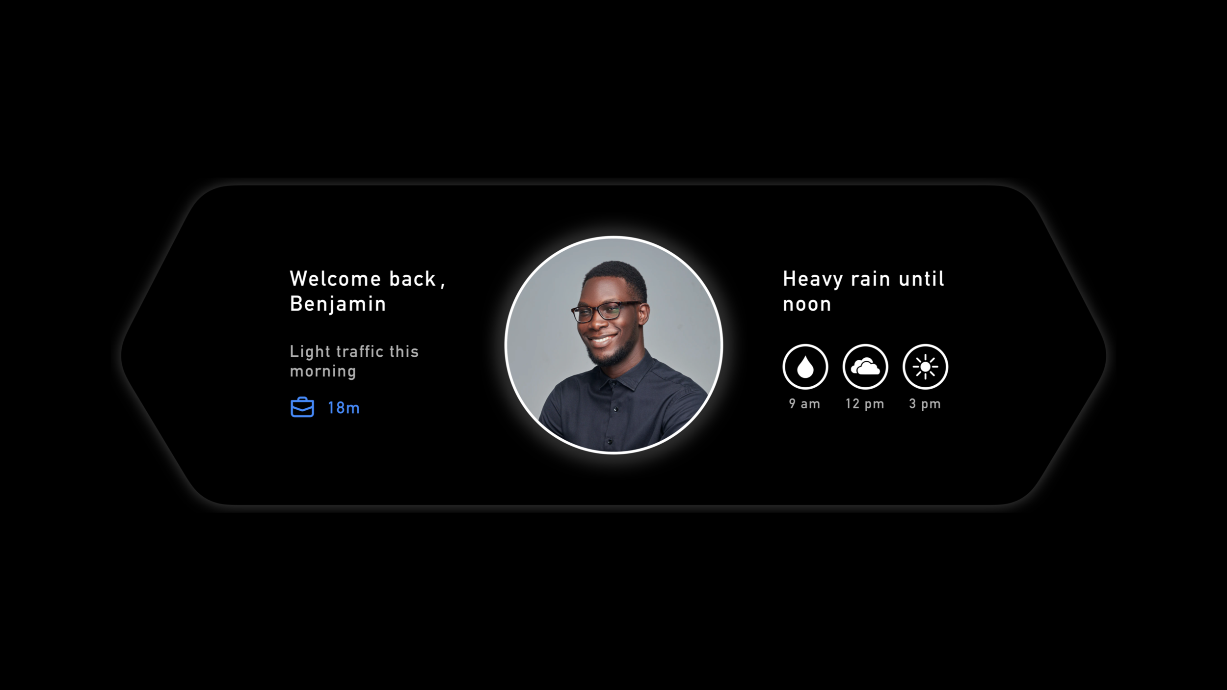
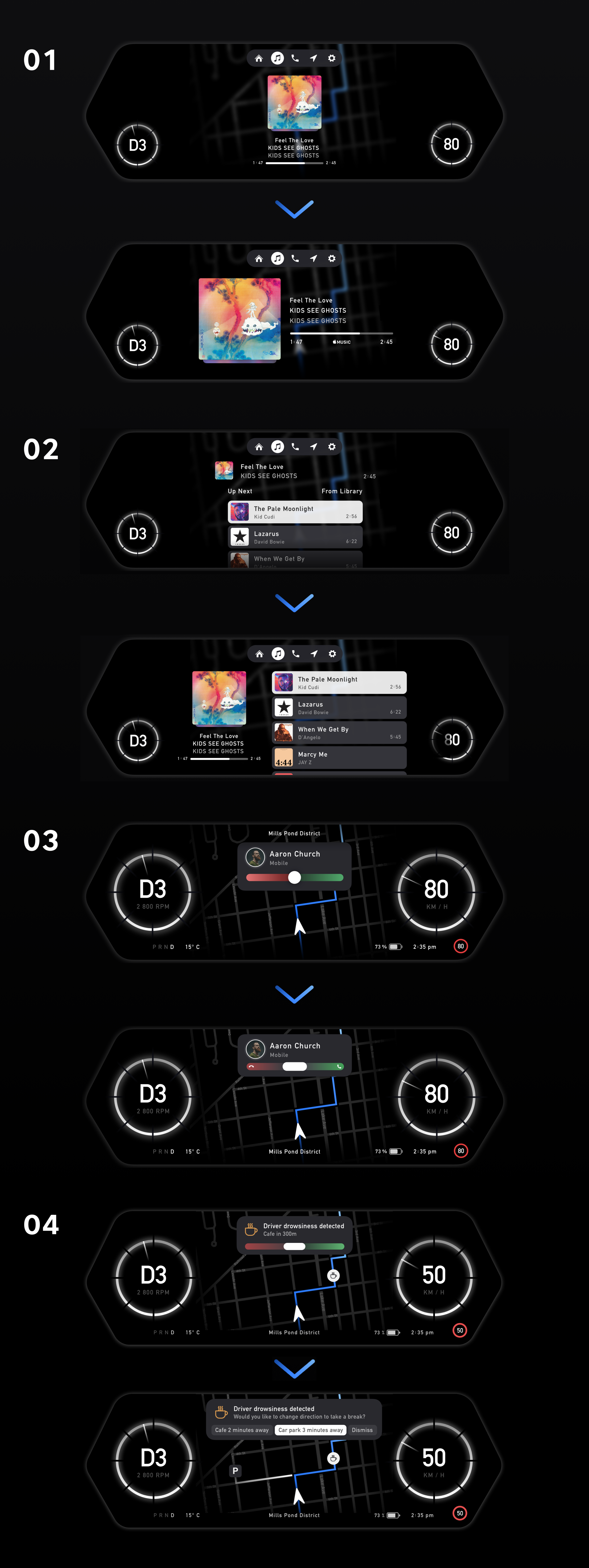
Personalised Driver Profiles
As soon as you start up the engine with your fingerprint, you will be greeted with a summary of your day showing the length of time to your next destination while your vehicle also sets your own personal preferences from your profile.
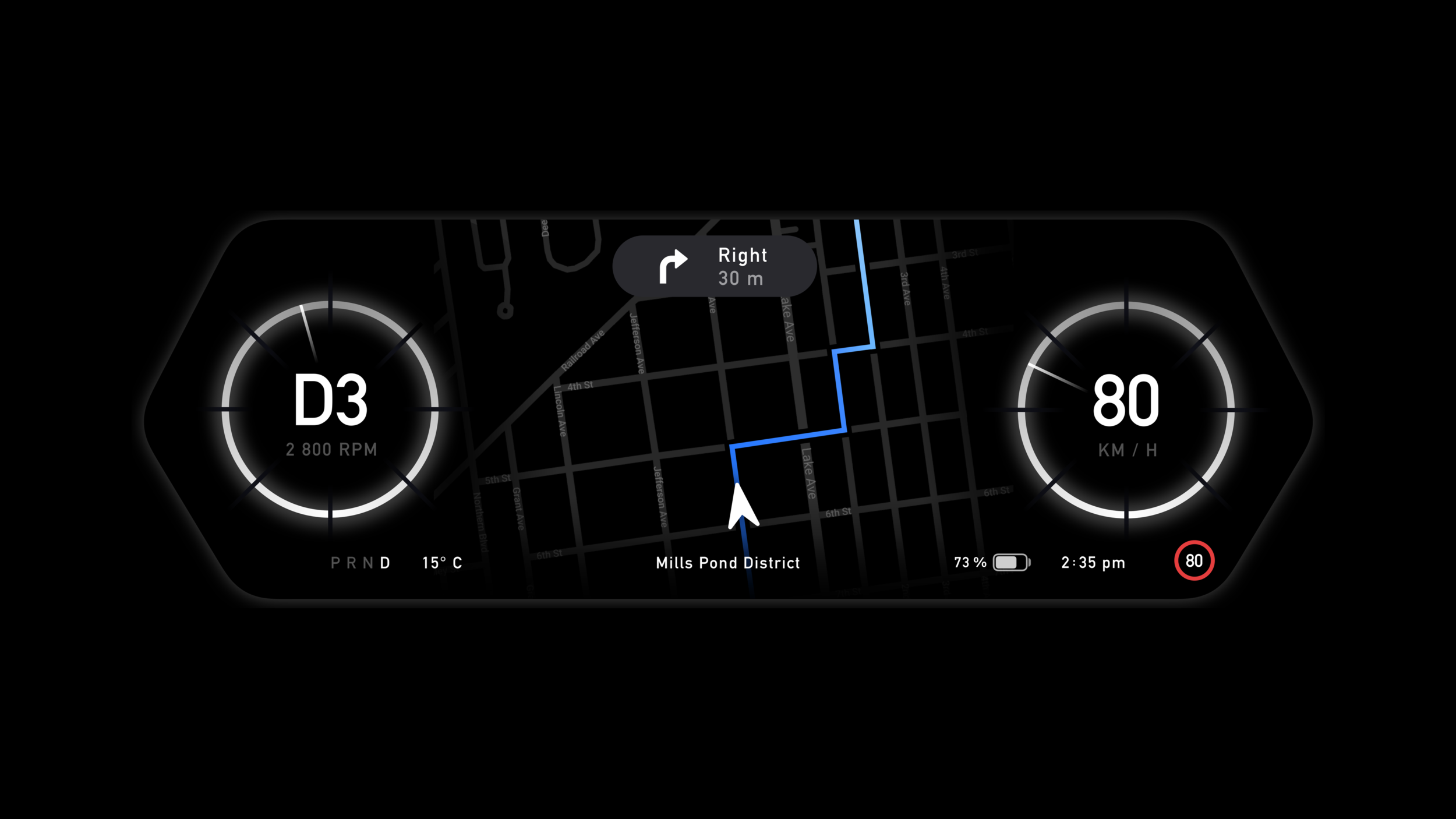
Your Dashboard, Simplified
Receive all of the vital information you need on the status bar of your dashboard at a glance. Never lose track of the speed limit as it automatically updates in the status bar through the use of your location and Apple Maps.
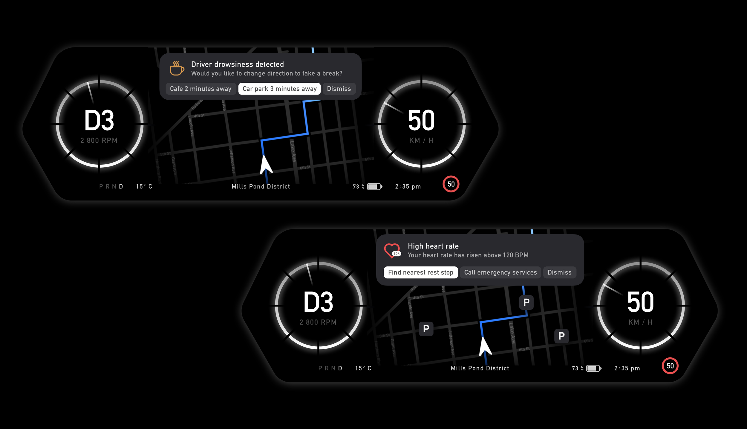
Safety Made Seamless
Artificial Intelligence monitors your well-being by analyzing facial expressions, eye movements, and steering patterns to detect driver fatigue, issuing alerts to suggest taking a break. Wearable integrations can also provide medical data, such as heart rate, enabling necessary actions like pulling over or contacting emergency services in case of an emergency.
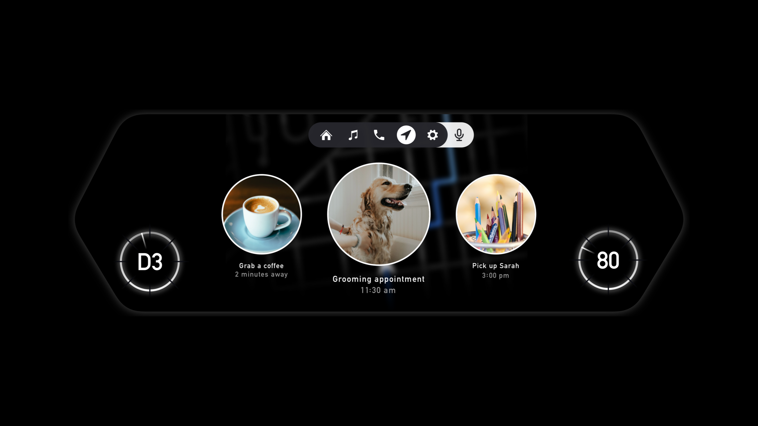
Get The Suggestions You Need
Receive travel suggestions based on what you're doing, your location, the time, and the reminders app on your phone to get the most accurate suggestions for your day, or just use voice control for a specific location. Navigate through your suggestions without having to take your hands off the wheel through the use of the buttons on your steering wheel .
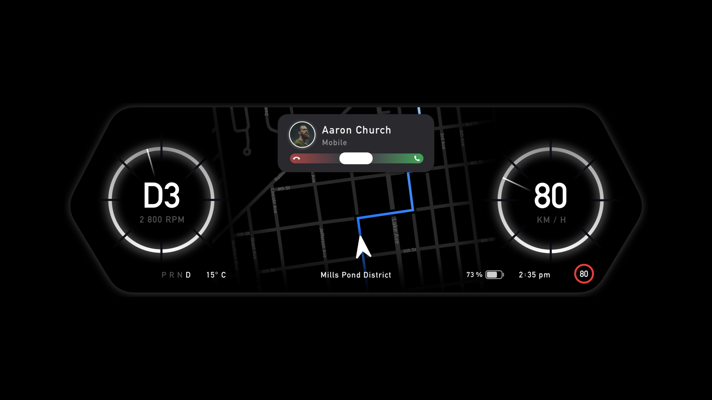
Answer and Receive Calls Safely
Swipe to answer calls securely on your dashboard, no matter what you are doing, through the use of the steering wheel’s touch pad. Bluetooth on your smart phone allows incoming calls to be displayed on the dashboard superseding the need to use your phone while you drive.
My Process
To begin my process, I asked myself several key questions to better understand the project's users: Who are my primary and secondary users? What goals do they have? What vital features would they need? To define the project's scope, I conducted primary research and planned to follow up with interviews. Once I had a clear understanding of the users' needs and felt confident in developing a meaningful solution, I created a prototype to test with these users.
Preliminary Ideation
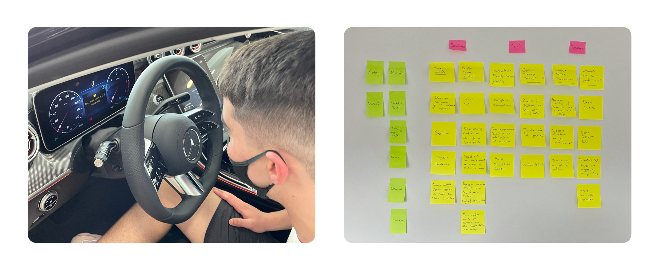
I explored the current offerings from car manufacturers to shape my understanding of the existing landscape. Based on my experiences, I created early notes outlining key aspects I felt this project should represent. This helped me organise my thoughts before planning the interviews.
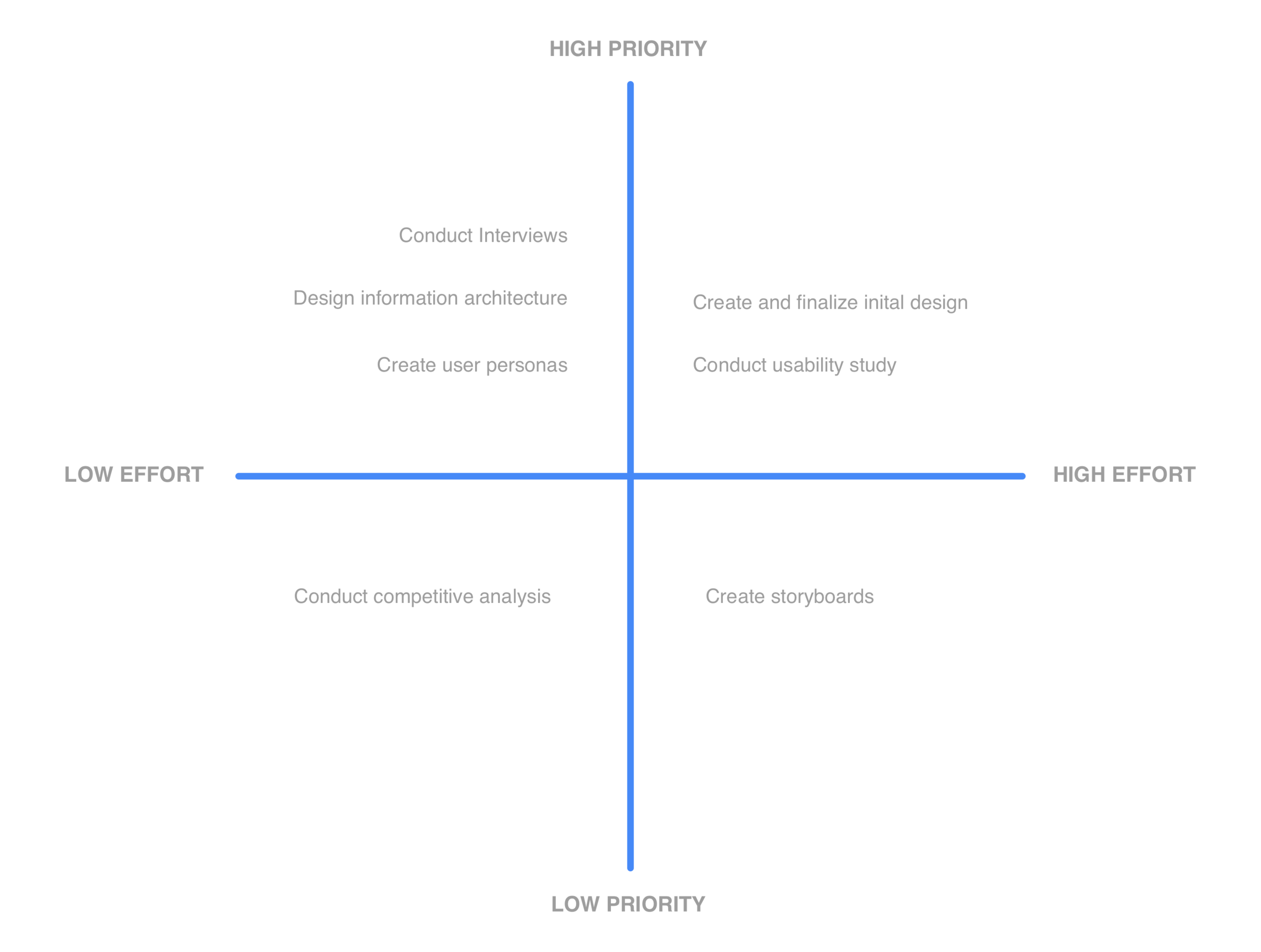
Prioritisation Plot
To assist in organising my process for this project I created a prioritisation plot to separate the high priority aspects of the project from the low priority aspects. Although at the end of the day all parts of the project do hold a certain level of value, it was important for me to understand which sections I should focus on more in order to have the project completed by the deadline.
Interviews
Once I had outlined some early assumptions and ideas, I proceeded to conduct interviews to understand the challenges faced by drivers and what their needs were.
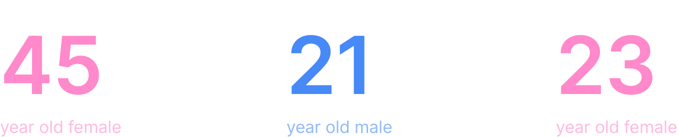
I conducted three in-person interviews with drivers from varying demographics. I developed an interview guide to structure these sessions, incorporating detailed notes on conducting the interview, a list of questions, and designated space for note-taking. To maintain consistency, I focused on covering the most critical questions within the one-hour timeframe, while marking any unanswered ones for later review. This strategy ensured a standardised approach across all interviews.
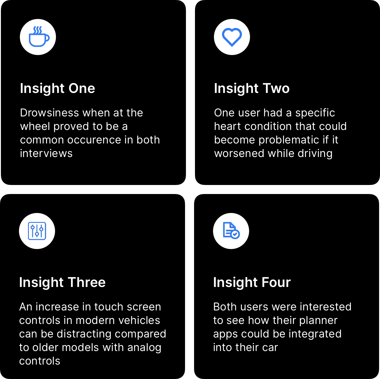
Actionable Insights
After completing the interviews, I analysed and organised the notes in my guide. It became clear that users preferred a minimalistic relationship with their cars. This insight shaped my approach and guided the design language for the project.
I consolidated four of the key findings into actionable insights that could inform and guide my design decisions moving forward.
Empathy Map
It was time to make sense of the data I had collected about my users’ experiences. My goal was to review the research and take detailed notes to develop a deeper understanding of my users’ thoughts and feelings. This process also helped me organise and structure the qualitative data.
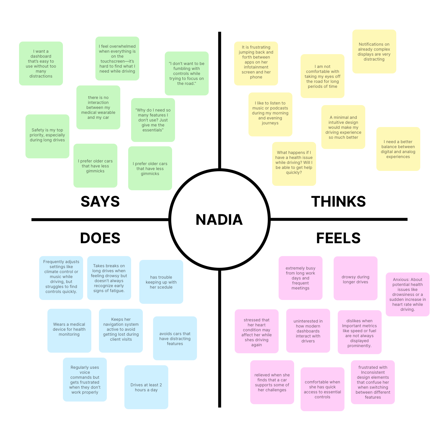
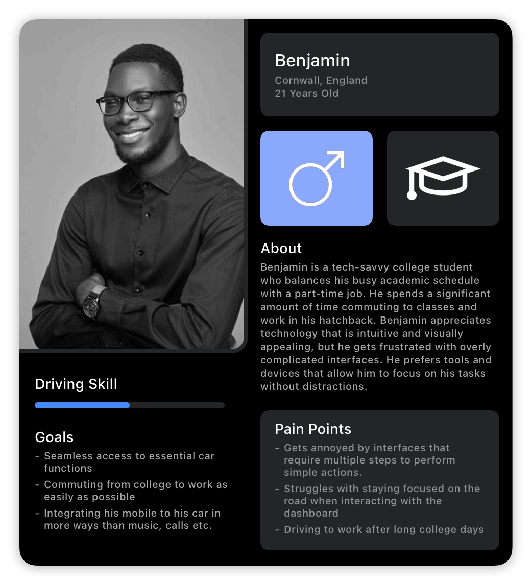
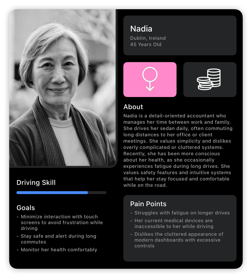
The Users
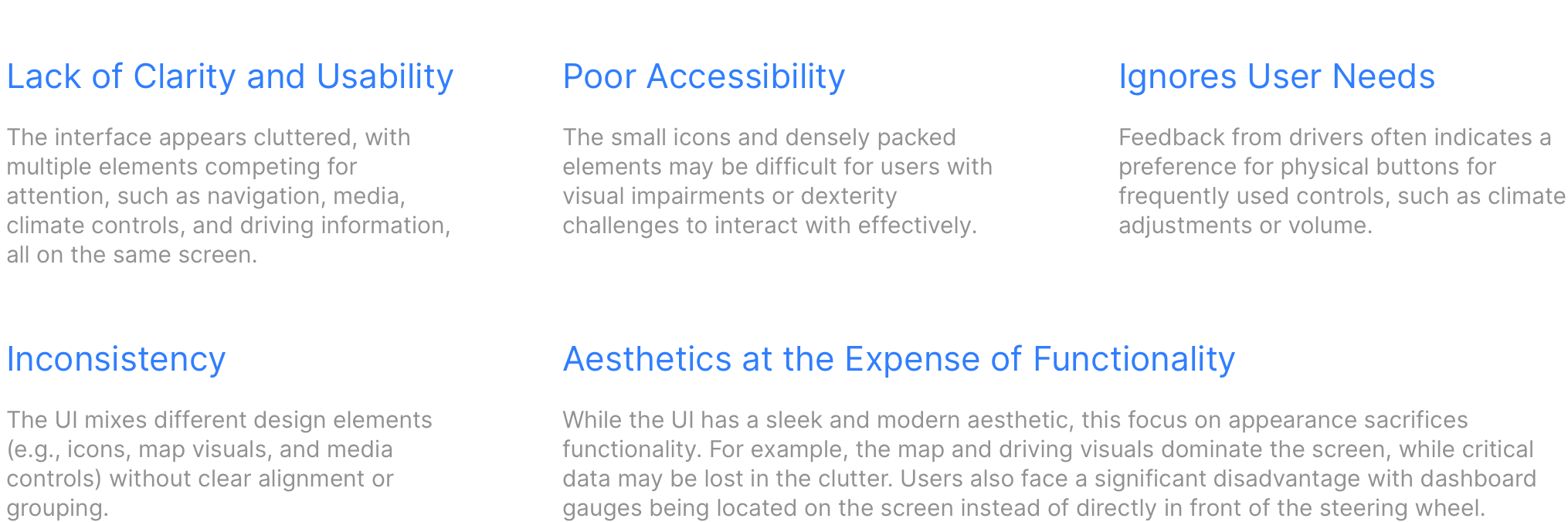
Modern Dashboards Are Perfect
Well, not really. Bad design is everywhere, and the results of my research prompted me to explore the current interfaces in modern cars. After all, I had to understand what exacty the participants of my interviews were talking about! To do this, I chose to examine an example from the leading electric car manufacturer, Tesla. I conducted a detailed review of their design to identify its weaknesses, aiming to avoid similar pitfalls in my own work. To structure my analysis, I used the following guidelines to guide my review.
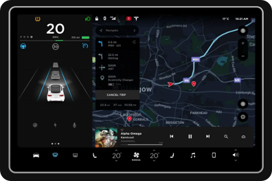
Understanding What’s Wrong
Story Boarding
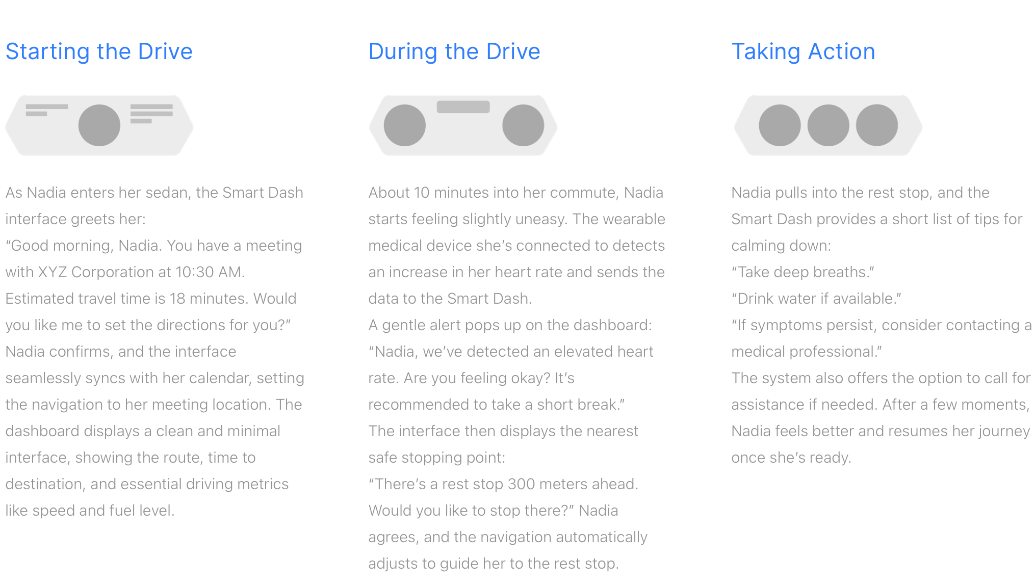
I created a storyboard illustrating how the user's calendar and daily schedule could be seamlessly integrated into the Smart Dash interface, using some expert level imagery. I experimented with a different approach to depict the user experiencing an increased heart rate and how Smart Dash could assist in managing the situation.

Context Scenario
Information Architecture

Wireframes
Preliminary Wireframing
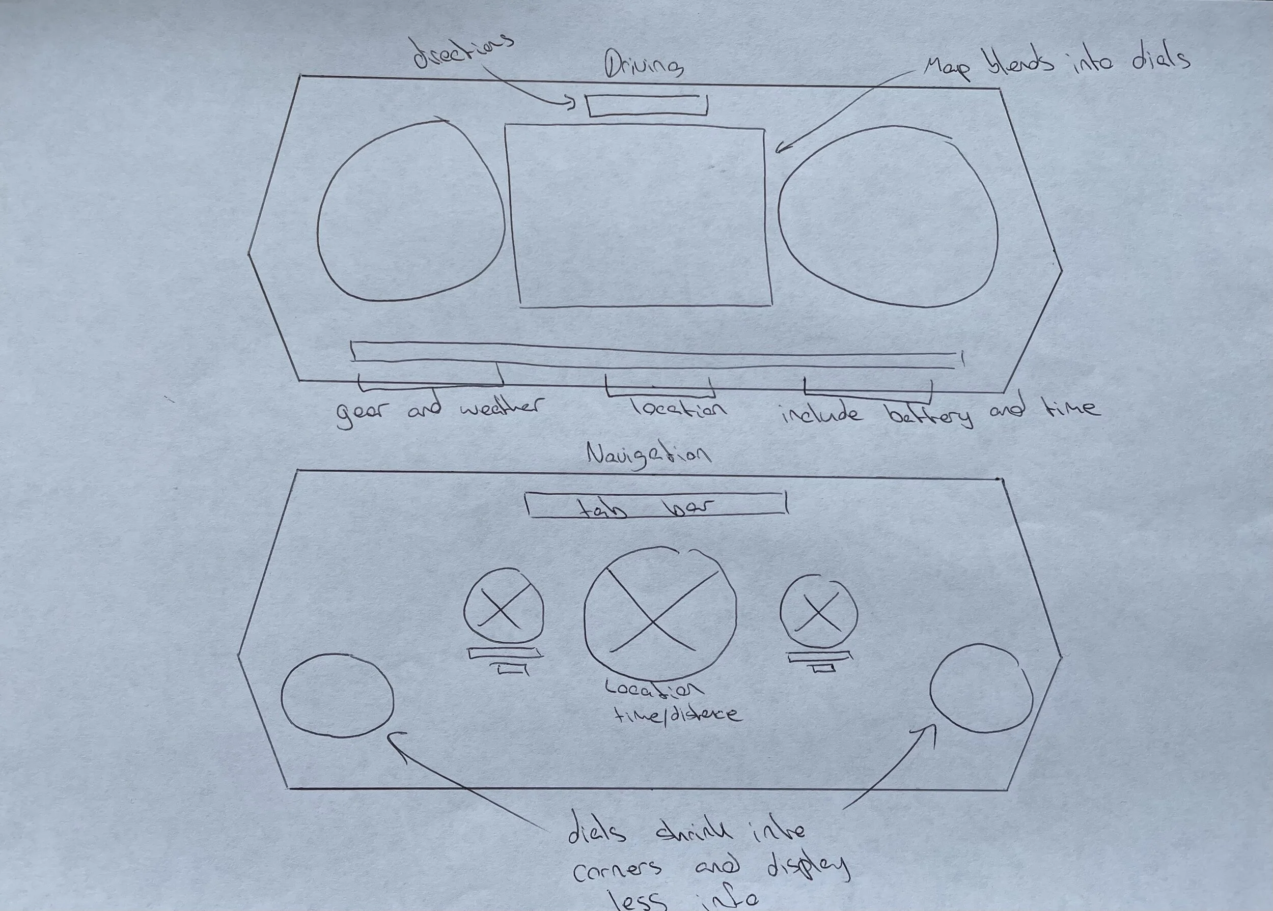
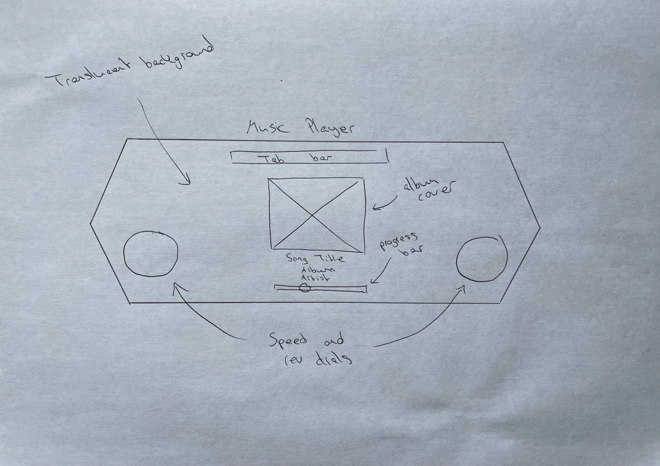
Before designing the screens for my project on paper, I first focused on determining the shape of the dashboard using Sketch. I felt this step was crucial because the shape of each screen would dictate how the content would be arranged. Once I finalised the dashboard's structure, I sketched initial ideas for the project's key screens, keeping in mind that I could refine or modify any features I wasn’t satisfied with later in the design phase. I also jotted down notes about specific elements on each page to clarify their purpose and improve communication of ideas during future iterations.


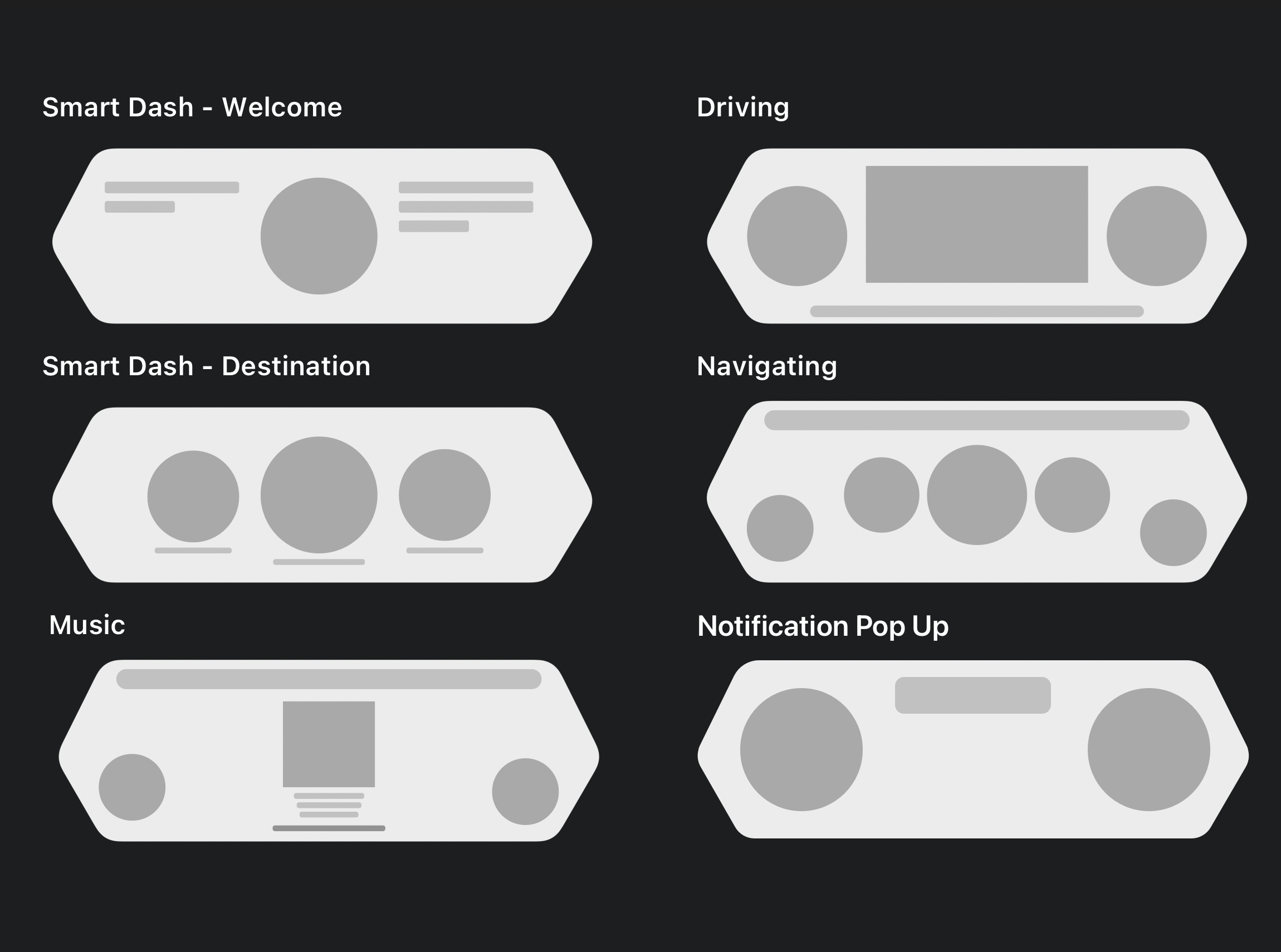
Low-Fidelity Wireframes
Before transitioning to high-fidelity wireframe designs, I wanted to get a clearer sense of what the core of the app would look like following the paper wireframes. This process helped me resolve some issues related to the placement of certain features and how they would be presented. The notes I had previously written on my paper wireframes proved to be useful for visualising the dashboard effectively.
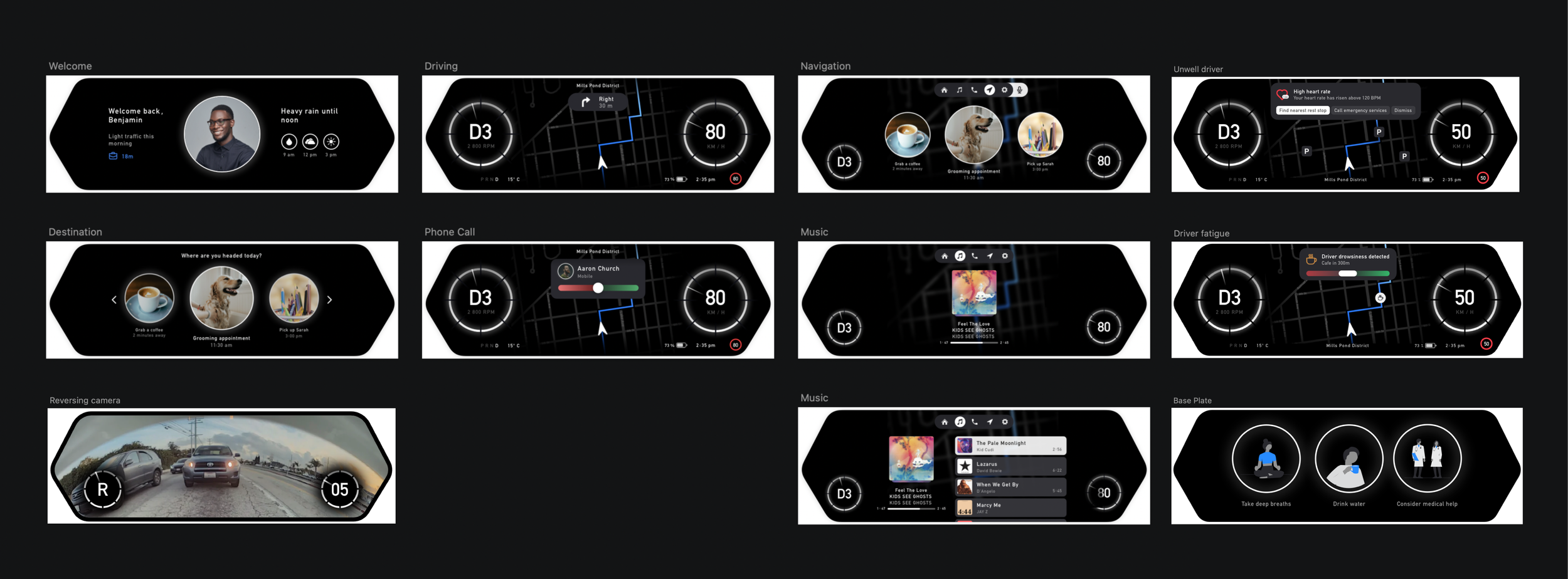
High Fidelity Wireframes
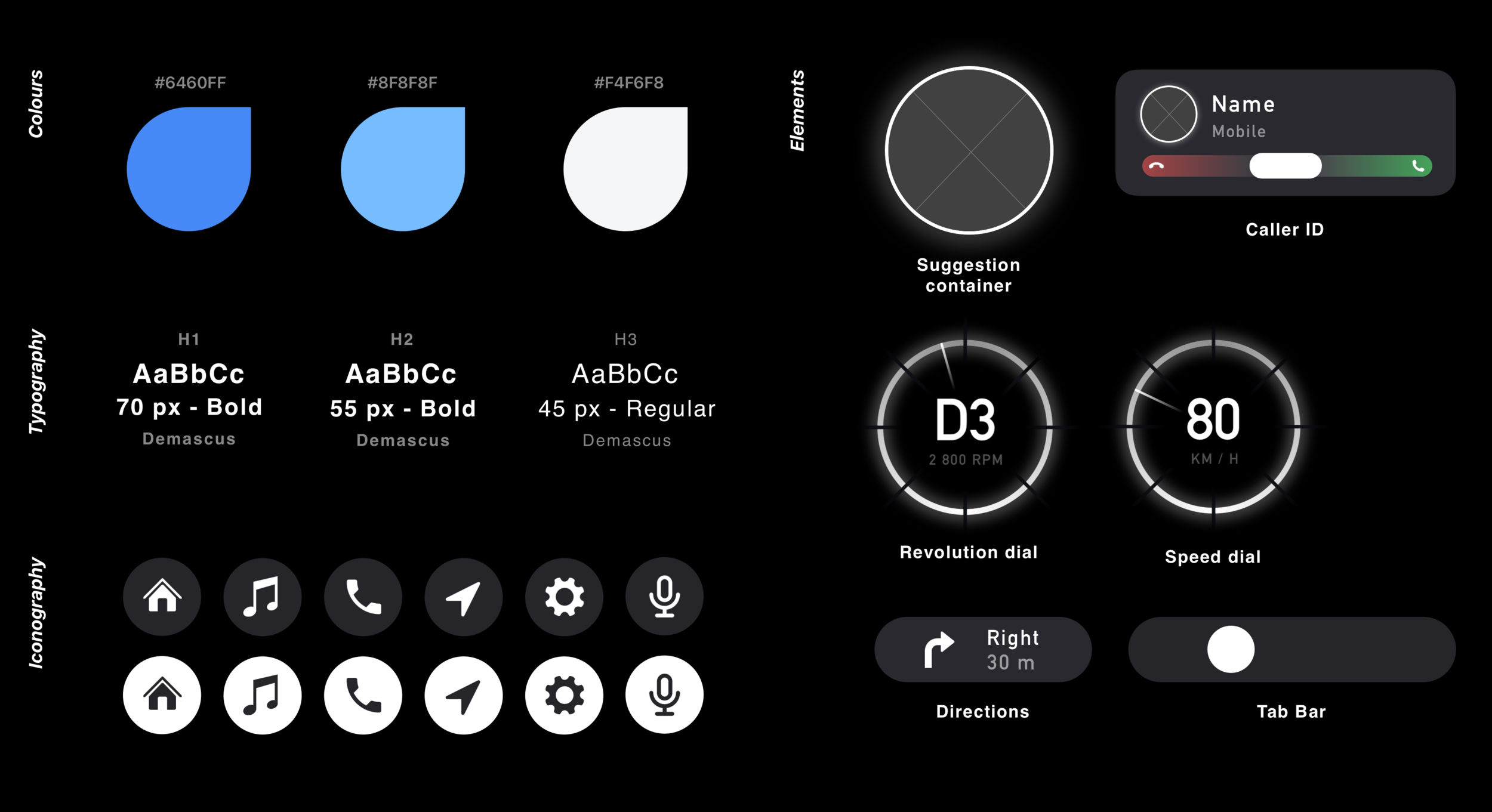
Finally, I refined the previous designs into a prototype suitable for user testing. At this stage, I fully developed the design language that would be consistently applied throughout the interface, visualised the core functionality addressing the users' pain points, and finalised the colour scheme.
What the Users Had to Say

Design Iteration
After presenting my prototype to users during the usability test, I received valuable feedback about elements users expected but did not find in the design. I carefully considered their input and addressed these gaps by creating an updated prototype.
Sticker Sheet
Takeaway
The Smart Dash was designed to adapt to users' everyday scenarios and simplify their lives. As a car enthusiast excited about the future of automobiles, I aimed to create an experience that demonstrates how technology can eliminate unnecessary complications. While this project was developed within a 5-week timeframe, there is significant potential to expand beyond the solutions I introduced. I would love to further develop the screens outlined in the information architecture diagram and envision the design of the center console screen. However, given the importance I place on reducing distractions in modern displays and prioritizing safety, I focused on these aspects within the time available.